ROSS Intelligence
Designing AI-powered legal research flows.
Branding
Brand Workshop
Visual Identity
Web Design & Dev
Explaining A.I.
Product
Designing for AI
Design Systems
ROSS Intelligence is a Toronto based legal technology startup that uses artificial intelligence to make the legal research workflow more efficient and effective.
As the Design Lead working in an agile product development process, I advocated for design end-to-end in the development process; from brainstorming and interacting with users to developing features and products for release.
Brand
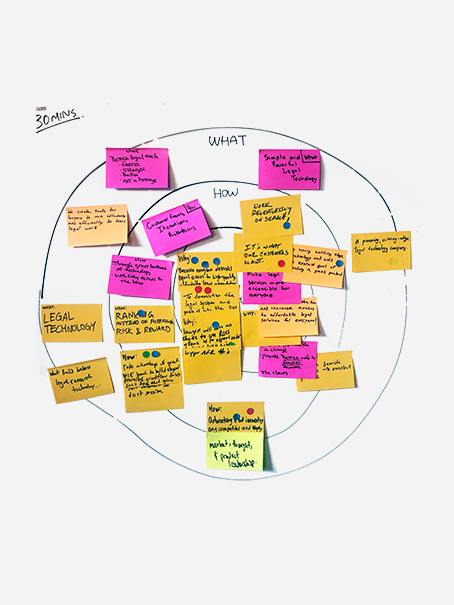
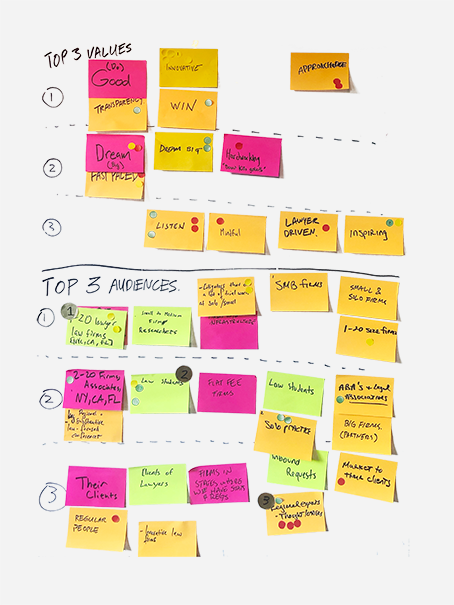
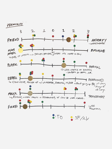
I pushed hard for a big update to the brand identity which had not been changed since the founding of the company. I conducted long format surveys that uncovered how different employees, customers and other lawyers perceived the company’s brand and product, which highlighted a disconnect between the lore of the company’s Silicone Valley story and it’s actual product.
The surveys also helped us to determine what was most important to visually communicate about the company, which influenced our visual choices later in the branding process. We interviewed every type of potential customer, from legal librarians, summer law students, associates to name partners to better understand what type of values they would associate with an aspirational legal company. These insights were all distilled in a 8 hour brand sprint that ultimately became ROSS’ first brand book, with the cooperation of the company’s department leads.
-
We drew some key points from our workshop:
1. In order for our company to be successful against such large incumbents, technology would be our only path. Digital first.
2. We need to think long-term and build trust with our skeptical audiences over time. Let's focus on organic growth.
3. This is a heavy industry with consequences on everyday people’s lives. Get serious and be professional.
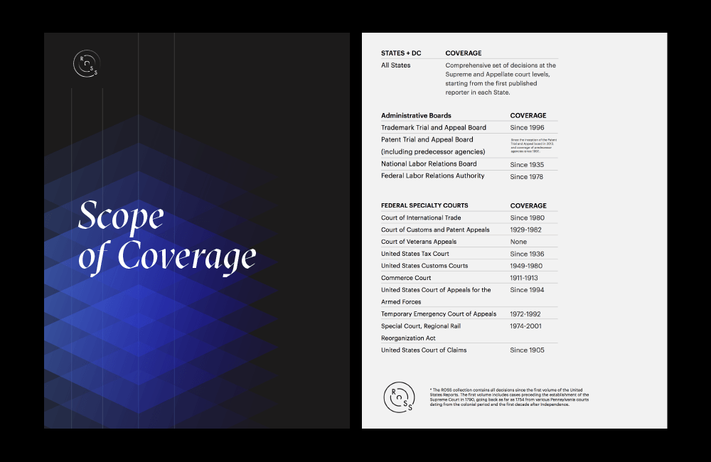
The visual identity of ROSS was designed to be viewed digital first with an square 1:1 aspect ratio that better fits social media, app icons and other online applications. The co-founders also found it important that our new logo reference back to the previous, so we kept the silhouette of the lettering similar.
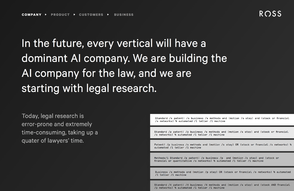
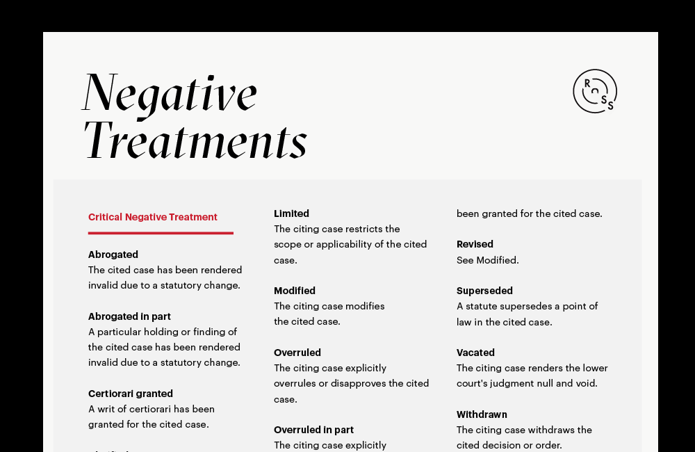
The stark, mainly black & white colour scheme and bold typography was inspired by newsprint, historically the method by which legal decisions were discussed and debated by the the public.

Web
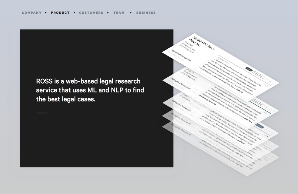
We overhauled the online presence with a new website that better explained the product and cut through the ‘AI’ buzz with explainable, chronological story based explainers. At the end of the day, time on site increased 250%, qualified traffic increased 120% month over month and our paid sign up rate increased 1.3% with no ads.
So how did we achieve those numbers?
We were able to draw industry specific issues from user research and design subtle solutions.
1. Lawyers are too busy to understand AI and everyone is using it as a buzzword in their marketing.
2. Distinction between products in our competitive landscape are hard to see from 20 feet high.
2. Distinction between products in our competitive landscape are hard to see from 20 feet high.
Highlight Product Differences
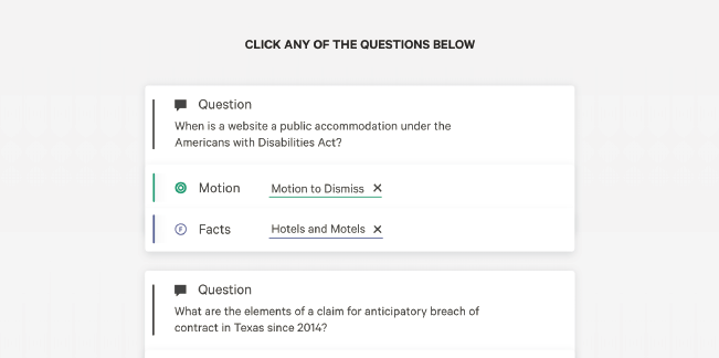
At first, we constantly found ourselves trying to match features with our competitors, which would make it hard for users to focus on the the strengths of our product. By iterating through prototypes and experimenting with copy, we shifted our focus onto the ‘question and answer’ paradigm, our biggest product differentiator and consistently repeated that message across the entire website.
Explain AI Transparently
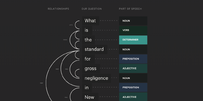
One of the most challenging but rewarding parts of the website including an interactive AI explainer, that would help potential users better understand how AI could streamline their legal research process. By communicating our research process so transparently, it helped build good will towards our brand and demonstrate our expertise in the field of AI and machine learning. Users spent an average of five (!!!) minutes on this page.
Targeted Messaging
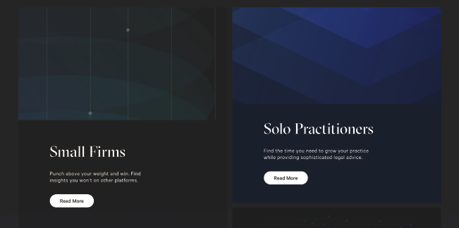
Our previous website only featured testimonials and quotes from big law firms that we viewed as the most prestigious and well known, thinking that we could capture lawyers in small to medium firms (85% of all active lawyers in the U.S.) via a trickle down. This was wrong. Instead, we missed out of our biggest demographic of users because they assumed that the product would only fit big enterprises that had IT infrastructure and would not be a good fit for their subject matter and practise.
Product
At its core, ROSS is a legal search engine that allows users to search for case law with ‘natural language’ like a question (Are oil and gas leases executory contracts in North Dakota?) as opposed to using database boolean operators (oil AND gas AND (executory /1 contracts)).
The incumbent research platforms, Westlaw and Lexis have defaulted to boolean operators because it provides a high, high level of precision at the expense of breadth and guidance. At some point, the incumbents have decided it would be best that they simply provide the users the tools and ask them to dig. ROSS is trying to be a search platform, whereas the incumbents seem satisfied being curators of legal literature.
In 2019, the product and team underwent drastic changes which led to a complete redesign of the product. The new ROSS app had a number of business objectives that we were to support through a better and more cohesive user experience. Primarily, we were tasked with better engaging and retaining new signups through the landing page that did not have the personalized training. From a design perspective, we jumped at the opportunity to rethink the navigation with our cache of user research and observations and creating a more focused searching and reading experience.
Unfortunately the details of my work is confidential. Please get in touch if you are interesting in speaking with me.
Exploring User Journeys
Right away, the team had challenges using more traditional methods to do user testing and research due to the perceived value of time to our customers. Most lawyers bill by the hour and have pressure to be billing their time accordingly. In addition, concerns about privilege led to conversations that were vague at best. However, through a combination of brute force user testing, generous samaritans and mountains of usage data we were able to build user journeys for both experienced researchers and first year associates.
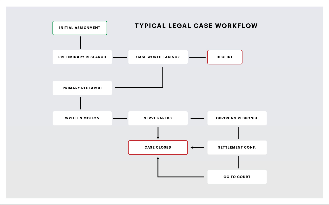
Our biggest takeaway: Our users’ search experience was to exhaust their results and understand the landscape of case law, whereas a typical Google search was to simply find the first reasonable answer.
Design Systems
When I first started at ROSS, the engineering team was in a state of constant releases which were fragmented in terms of user interface consistency. For example, there were 47 shades of blue, 16 shades of grey, and even a hot pink variable.
I began work to start cleaning up the interface and together with the engineers devised a re-skinning of the application in hopes of shortening release times, improving consistency and reducing tech debt. This project was designed to be pushed in 6 gradual but quick releases and involving implementing a new navigational tab, grid layout, type changes and a simplified colour palette.
2019 Redo
Early in 2019, we were given the green light to devote time into rethinking the app's structure with the new insights we collected. The redesign saw the introduction of a completely revamped navigation and information architecture.
For the main navigation, we developed ‘blocks’ that were generated horizontally as the user navigated through the legal research process. Each block contain a number of standard elements including a consistent title, save/annotation features and options menu. This allowed users to quickly toggle back and forth between cases and search results, as well as iterate on their search query until they found results they were satisfied with. Creating full responsive components that were isolated into blocks allowed us to automatically scale them to better direct the user to their desired primary action (reading a case, skimming summaries).
Designing for AI
General intelligence, the level of AI that we see as sentient, is still years away. The general perception of where AI is today, is led mostly by enchanting, provocative news headlines of breakthroughs in the field. This perception, along with the need ‘focus on our value’ led to newfound discussions around the user interface of the product.
Our team identified three questions that we should always be aware of when creating new features or pages.
-
Discovery: How will users integrate this into their workflow?
Setting Expectations: Are we promising too much?
Explainability: How will users trust the results?