Sumo Insurance
Improving the insurance onboarding experience.
Product
Product UX
Understanding the Insurance Space
Multi-channel Consistency
Branding
Visual Identity
Product UX
A startup at the DMZ working on insurance onboarding, improving user engagement through a simple, playful experience funded by Aviva Insurance. Sumo simplifies the signup process by cutting through the fine print and presenting users with a clean, easy to understand app that also unlocks personalized discounts that drivers are already qualified for.
Most of the work I did for Sumo involved working on product prototypes and discussions with engineers and co-founders.
I was initially brought into the fold to help the team creating prototypes for a investor pitch that was rapidly approaching. Most of the app was already laid out and most discussions I was involved with were based in aesthetics and feasibility. The first iteration of the product was prototyped on an iPad and involved users going through a very colorful 4 step process to fill out the necessary information.
Reframing the Brief
The pitch went well, enough for the company to receive attention from Aviva Insurance and be placed into the a sponsored incubator at the DMZ for further development. With more time to question and dive deeper into the use case of the product, I was able to dial back the root causes of friction in insurance onboarding with expertise provided by Aviva.
While the brokerage system provided a good human touch to the otherwise confusing process of signing up for insurance, survey data from Aviva demonstrated that many customers did not feel that their broker represented their best interests. Why? Some theories believed that customers were simply not interested enough in their insurance coverage during the time of sign up to develop a ‘trusted’ relationship with their broker. On the other hand brokers are deterred from acting in their customers’ best interests by their premium commitments to carriers and the difficulty involved in manually switching policies.
Subject matter expert also noted anecdotally that customers had a negative perception of auto-insurance, especially if they had a good driving record; ironically the most valuable customers in the industry. Customers were seeking the same level of convenience and service that they receive in their daily interactions from A1 tech companies (Apple, Google), and to have the digital tools to buy, manage and interact with their insurance distributors.
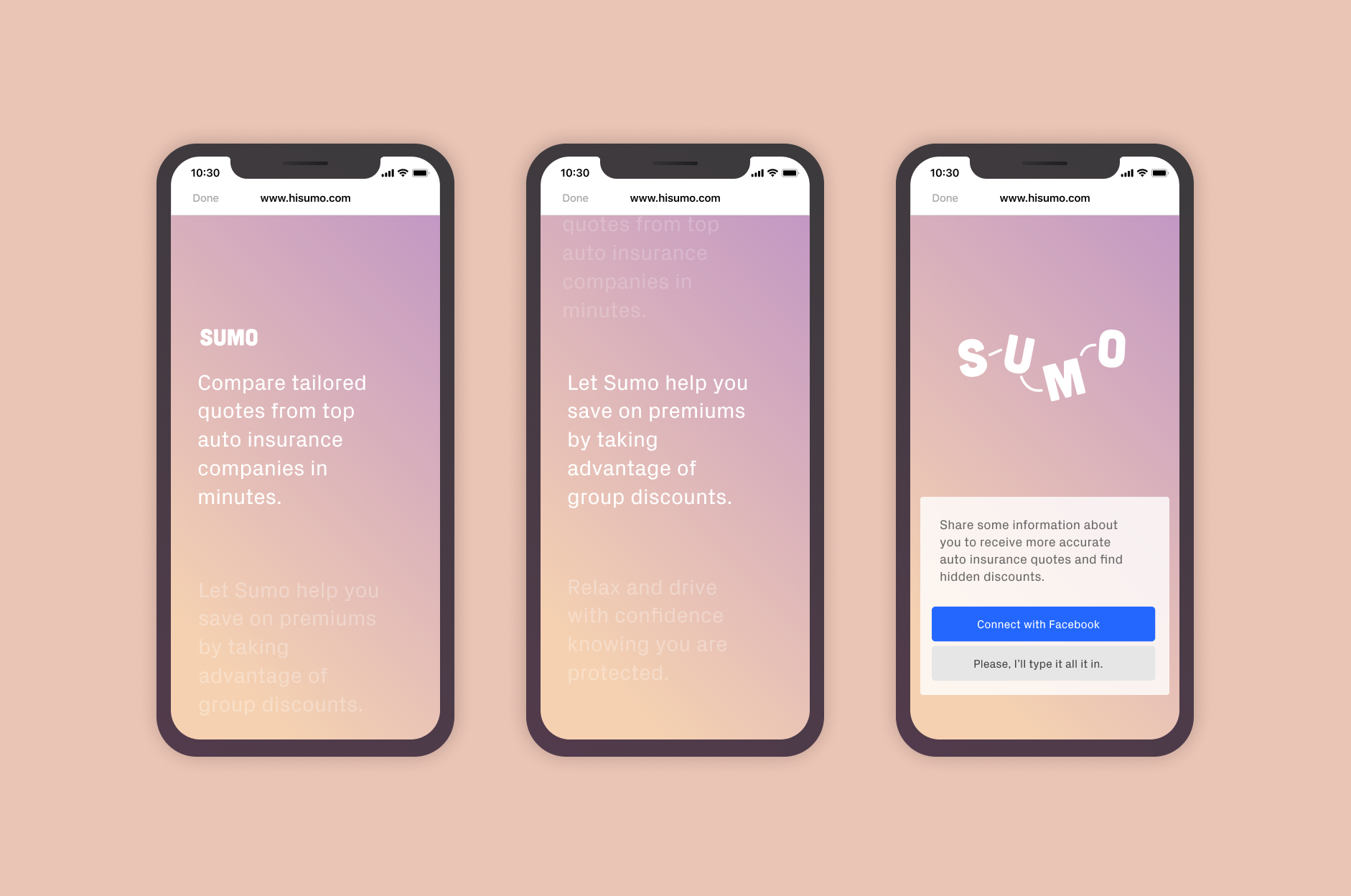
Creating a delightful web experience
The team started with a web app that could be linked to users via SMS, Facebook Messenger and other platforms. We organized all the info that users would need to submit into 3 neat categories, avoiding a 'junk drawer' category where users could lose out on discounts. Each category followed a similar process that walked users through each step and allowing them to double check and edit their information on the final screen.
Brand
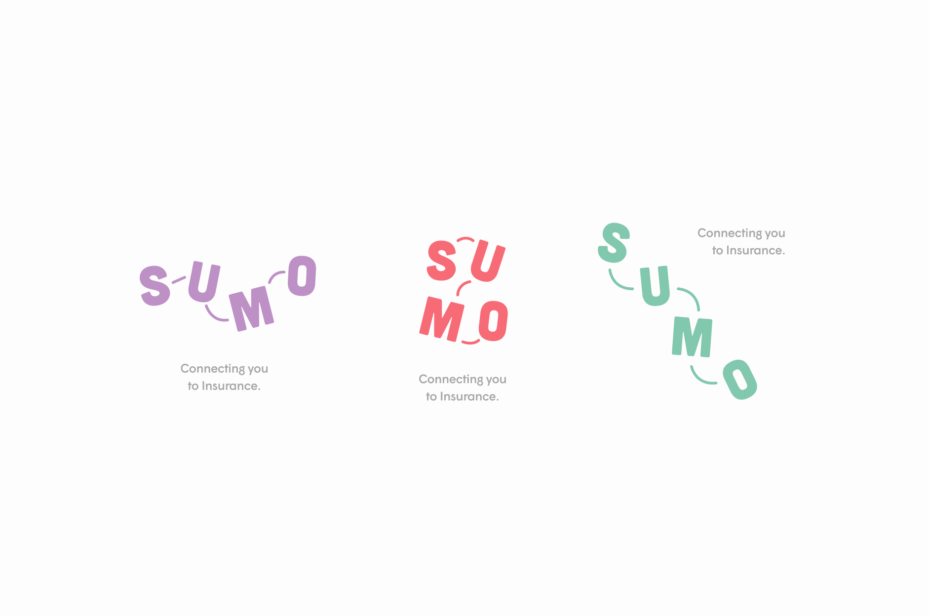
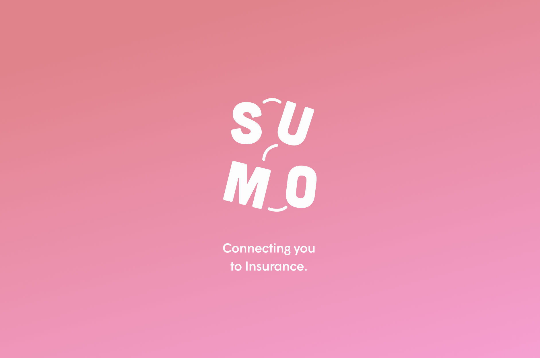
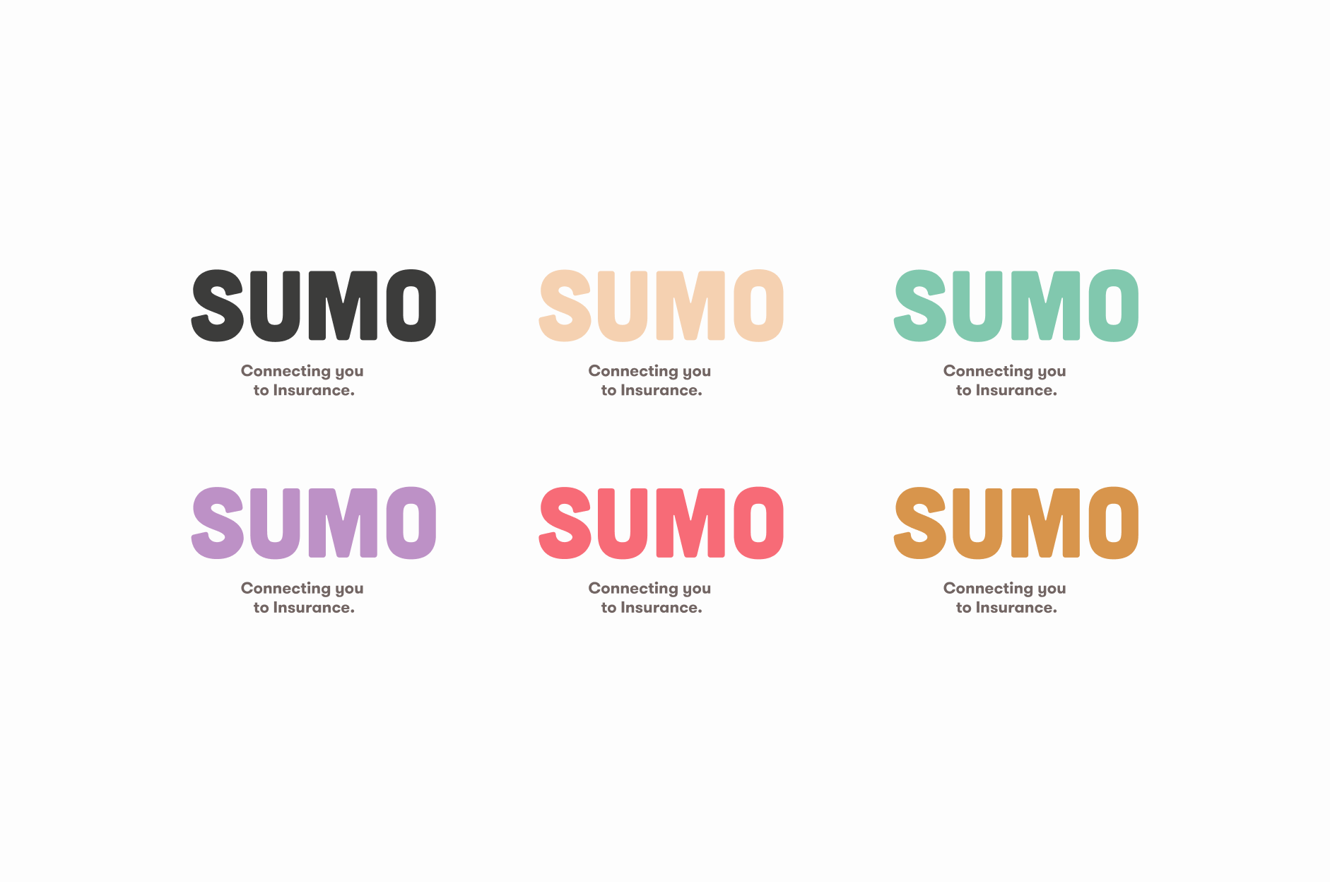
The ask for the Sumo logotype and brand was for it to be friendly above all else, as the co-founders believed that bringing a modern, friendly experience to the insurance market was first and foremost. I created a quick visual system that incorporated a chubby san serif typeface I felt matched perfectly with the quirky ‘sumo’ name. In addition, the short name and combination of letters provided great readability at different angles and alternative arrangements.