Big Hit Studios
Promoting a unique spin on class fitness.
Branding
Photography
Web Design & Dev
Customer Facing Website
Brand
Big Hit Studios is a kickboxing fitness gym that offers a fun resolve from other cardio-based exercises like running, swimming & cycling. It incorporates high paced movement and impact sports in a fun and accessible package to people of all body types.
I was part of a two-man team responsible for a complete rebranding of the company as well as an overhaul of Big Hit’s website.
We were able to identify that the audience was gradually, but very surely shifting to a primarily female under 35 demographic. At the end of the day, the brief called for a design that would better position the brand towards their new audience.

Visually, we settled on an all caps display slab typeface to anchor the other elements. We also moved to a color palette inspired by cotton candy, using hues of purple, baby blue, pink and red. We felt that this combination of type and colour could walk the line between 'serious' gym and 'accessible & friendly,' if the assets were used in tandem.
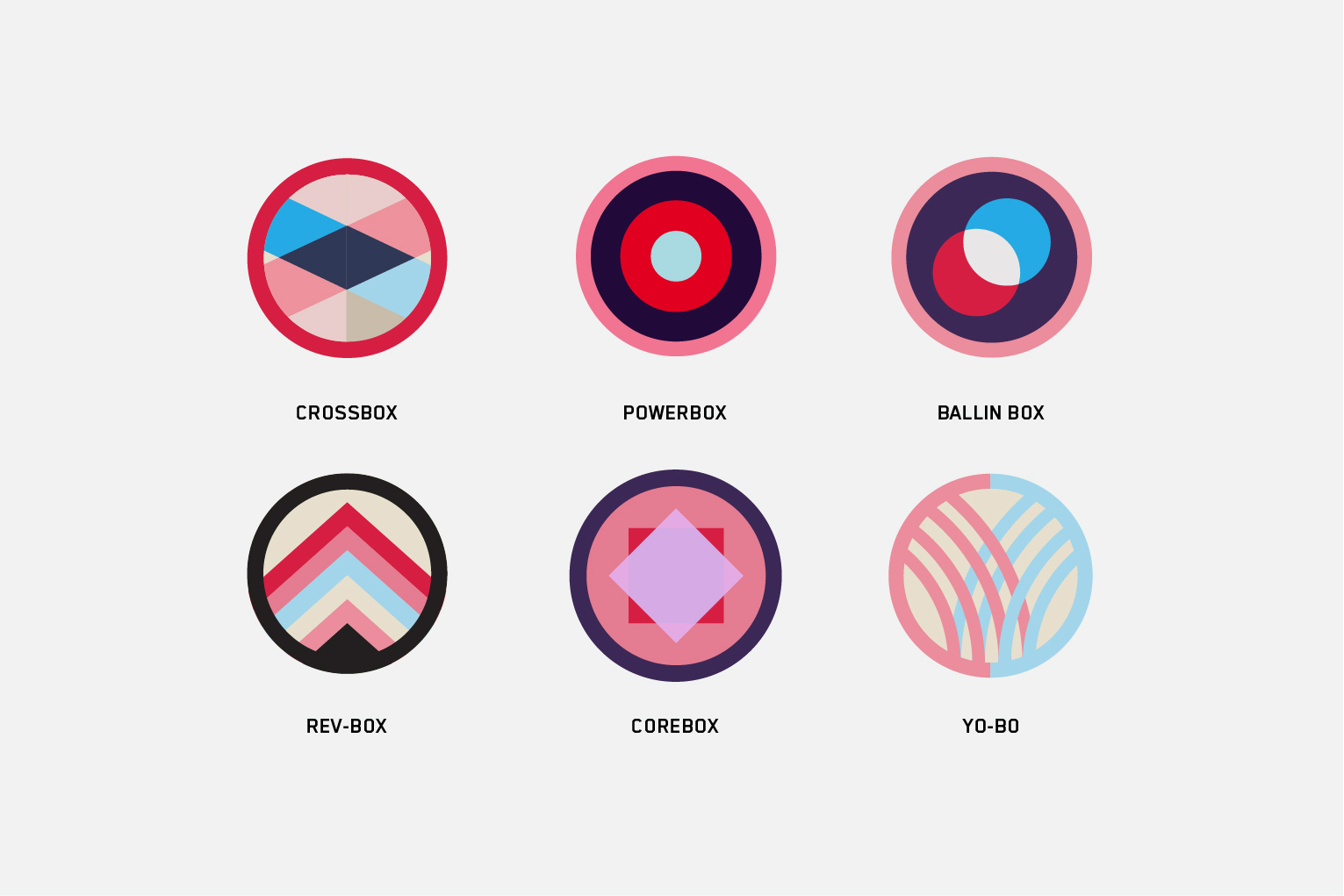
In terms of the retail product, one of Big Hit's biggest differentiators was the assortment of class types offered, as opposed to other kickboxing studios that offered only varying levels of difficulty. Each of these classes had unique styles, coaches and atmospheres. We decided to better emphasize these classes by creating individual patches and explanatory videos, so that each classes would be unique from the others.
Web
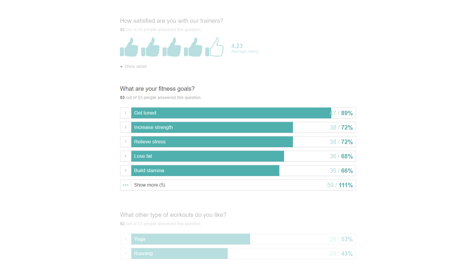
Given creative freedom with very loose guidelines, it was imperative that we understood the target demographic. We started off by sending out a short Typeform survey to 150 random Big Hit students.
Although we didn't get as many results as we had hoped, the survey was great as a starting point for gathering general user data, such as age, gender, fitness goals, and social media presence. However, this only skimmed the surface. We needed to go deeper in order to understand exactly what people expected and wanted to see in the new website.
Over a week, we asked several clients what they thought about the current state of Big Hit Studios, and how they use the website.
We also conducted some competition research to get a feel of the industry and how other fitness studios presented themselves on the web. We looked at 5 competitors that offered similar products to Big Hit and found that most businesses had more or less the same barebones information on their websites: a short introduction of the studio followed by descriptions of different classes, several pricing models, contact information and occasionally a blog.
After completing most of our research, we started to sketch out what we wanted to build. Our first iteration was extremely straightforward: a single page site that incorporated a floating button to pull out the scheduling interface.
We felt that this did not place enough emphasis on scheduling, which was one of the main improvements that we wanted to focus on. The second design was centered around the phrase 'Ready, Set, Go' - we assigned navigation to each word of the phrase which acted as subtle guided navigation.
Big Hit's final website design features a horizontally split layout that puts equal emphasis on new and returning students. The READY & SET panel contains information on Big Hit's class offerings, short blurbs of various instructors, and a generic "who we are" section. For new clients, this is the section that they will be focused on. The GO panel leads to an embedded scheduling system supplied externally for both new and returning students to book their classes online.
Late in the process, the owners were worried that the layout proposed would lead to more bounces and fewer new sign ups. However they also acknowledged that encouraging existing customers to sign up for more sessions would lead to more annual memberships, leaving them unsure of what direction to take.
We opted to answer this question by spinning up a simple A/B test that sent half of users to one version or the other. Test A included the layout and Test B was a more conventional page that included scheduling as a link in the top nav.
We waited for two months to reach statistical significance. Results? New customer signups were similar for both pages, but there was a 19% increase in returning customers on variation A, which finally answered the layout question.