Bestiny
Building habits with
users in app.
Product
Expedited Onboarding
Building Habits
Branding
Visual Identity
Product UX
Bestiny combines technology with real feedback from industry experts and those in your network that can actually coach you to improve. I worked on the branding and MVP of this Toronto based startup.
We developed a prototype and MVP for the pitch with several key ideas that we thought could encourage signups and everyday usage.
Giving to Get - Providing Faster Value
We worked under the hypothesis that our early adopters would be motivated to return to the app based on the virtue of self-improvement. Early user testing and research showed this enthusiasm, especially of those users that self selected to speak with the team. However, we were able to acknowledge early on that our sign up process ask unduly of users before providing them any value. It was a serious concern that the concept would not be able to hold the attention of an ‘average user.’
The catch-22 here was that without sign up information, we would not be able to provide as impactful a first impression which could lead to large drop-offs anyways.
After ideating on several concepts, we designed ‘pulse questions’ that would ask the user 3 questions upon signup, and 3 more every day where we required more information. We chose to pose these inputs as a question, instead of as a form to better replicate the experience of a real, personal coach. When the user signs up with limited information, parts of the app are inactive and users are prompted to return next day to answer more questions. This way, users were able to see instant value in exchange for information input, while also building the habit of checking the app daily.
Building Habits with Gamification
Deriving the most value from any product in the self-help genre is a combination of a user’s personality and willingness to commit to a programme to better themselves. However, studies of gamification have shown examples of how product UX can create long term engagement and retention. We used metaphors archetypal to games like expiring items, unlockable screens, levelling up, badges and visual progress indicators all through the app to tie the overall experience together.
Here are some examples.
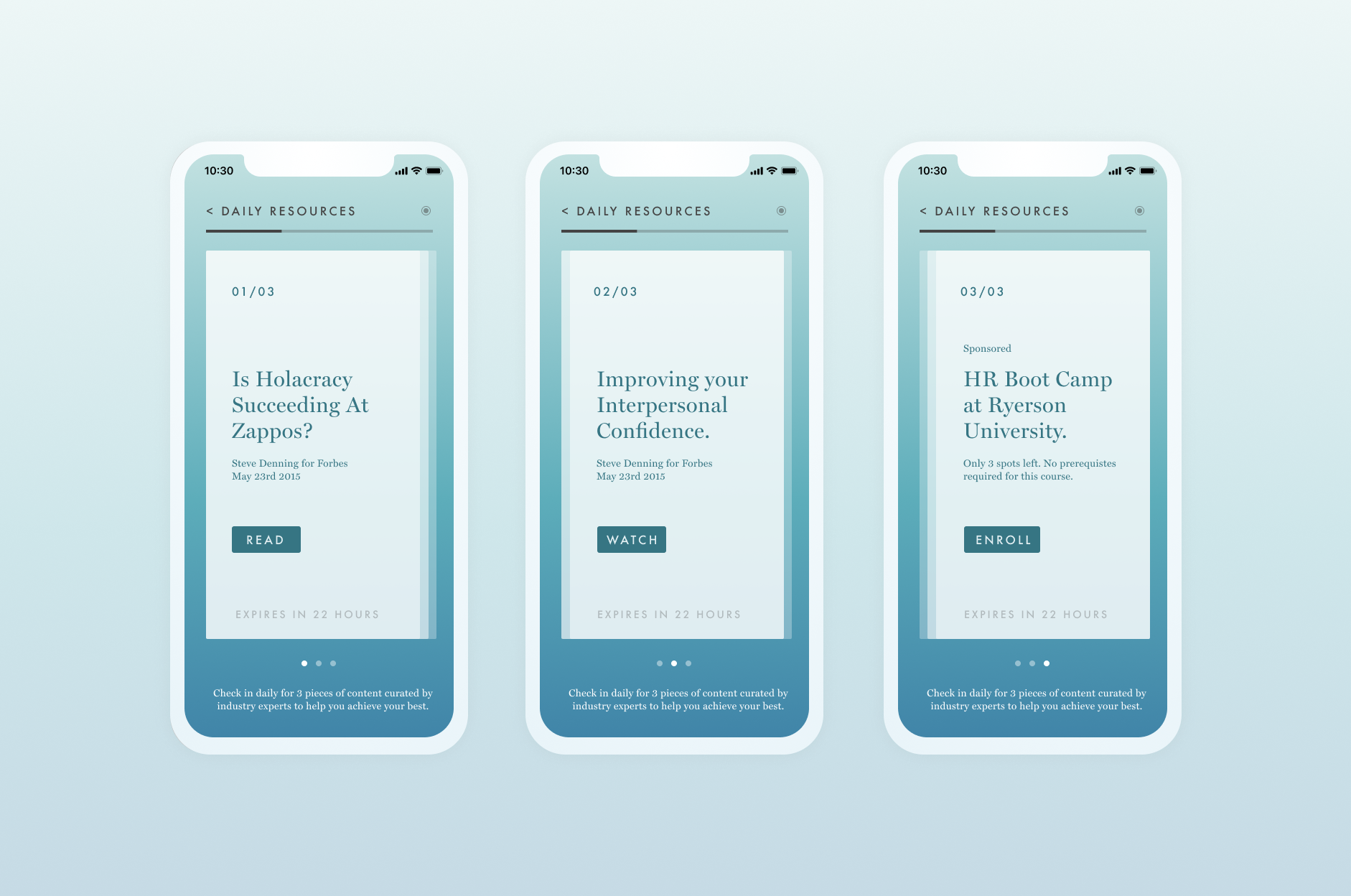
The ‘Daily Resources’ are curated articles, classes, videos, quizzes and other quick activities that are designed to stimulate users during their daily commute. Using a decision tree model, the engineering team built a robust aggregator that could feed compelling content to users. We did some initial research that helped with our product decision making, ending up with 3 pieces of content per day, with a push notification sent at 8am on weekdays.
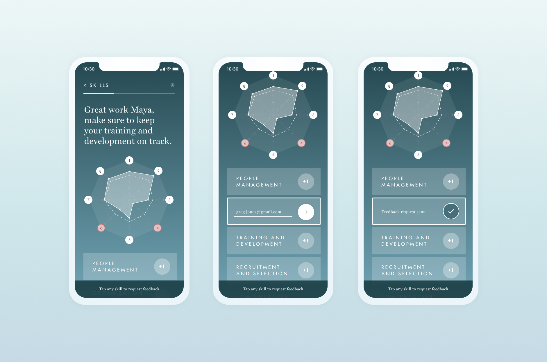
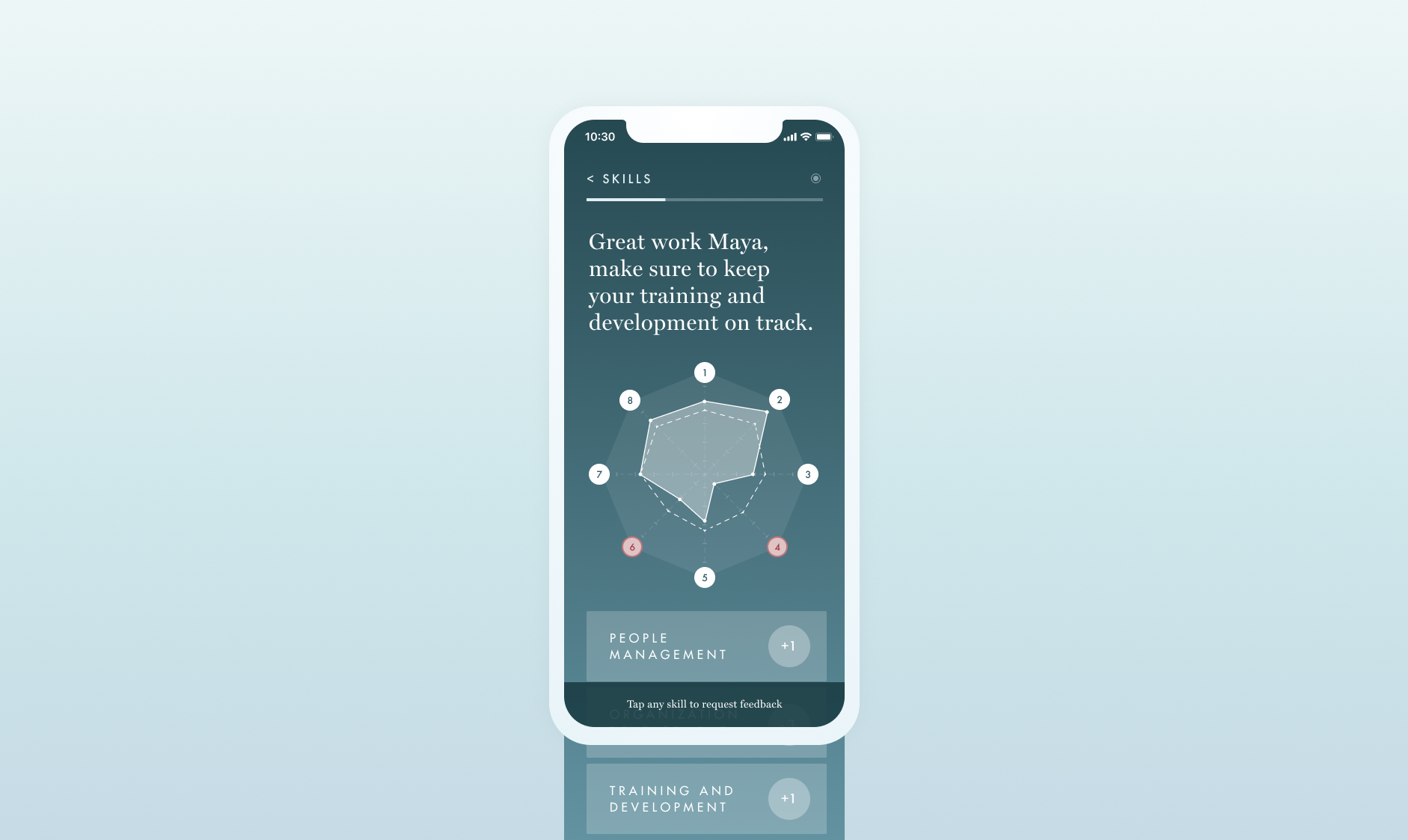
Users can self assess their skills in a guided process displayed through the app. We followed best practises of self assessment to allow users to create a varied list of skills and would offer others that we felt would be helpful based on their profession and seniority. As users completed pulse questions, daily resources and followed up on their roadmap, we would probed them to self assess themselves on a biweekly basis. We assigned points to individual skills, simply as a sliding scale that could be decided by the users themselves.
Furthermore to the self assessment was the ability to quickly request feedback from mentors, co-workers and friends in app that could help users create a more realistic assessment of their progress. The app provided helpful writing, and suggested appropriate questions that were tested to elicit the most honest feedback, thereby removing friction in the process.
Brand
Visually, the goal was to create a sense of calm and relaxation - a digital safe space for end user’s goals and ambitions. In the lead up to the investor pitch, we determined that the early adopters of this service would be very similar to the demographics of self-help and self-improvement audience, primarily urban women under the age of 45. From there, we were inspired by visual cues of wellness services that used low contrast imagery and pale, desaturated colours.
We also took colour cues from weather apps that used gradient backgrounds to furthermore create a link between colour and mood. We decided against illustration and photography in the app and web presence, in favour of slow moving gradients that subtly responded to touch or mouse input.